The 'All apps' list in the Start menu of Windows 11 gets a new grid layout
Many users have spotted the change in the beta build
2 min. read
Published on
Read the affiliate disclosure page to find out how can you help Windows Report effortlessly and without spending any money. Read more

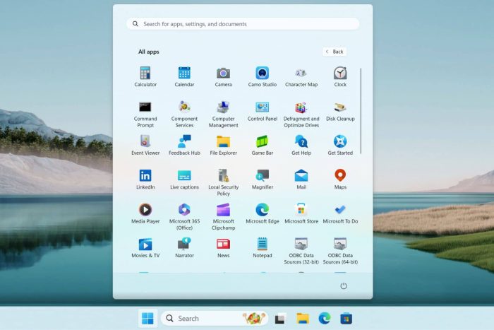
Microsoft is testing a new grid layout to display every single app under the All apps list in Windows 11’s Start menu. The new layout offers a similar vibe to the Windows 10X’s Start menu and is available in the beta builds.
The change was first reported by a Reddit user (@PhantomOcean3) who shared a screen recording to showcase the grid layout for the All apps list. The video showcases that the app icons are placed side-by-side and on top of each other to form a grid layout. This makes the app list look more organized and screen-efficient.
That’s not all, the new grid layout for the All apps list lets you see more apps without having to scroll more as you would generally do in the current vertical list. Also, you can find the apps quickly, thanks to the bigger icons that are easy to spot.
Although the new grid layout looks promising, there are a few concerns. Since many things are happening visually in the list, you might find it harder to read the app names. Also, if there are way too many apps on your device, the list might look cluttered at your end.
Moreover, if you’ve been using the vertical layout for a long time now; it will take some time to adapt to the new grid layout.
Do you like the new grid layout for the All apps list in the Start menu of Windows 11? Share your thoughts with our readers in the comments below.


